CommSite – The First Conversational Website
Overview
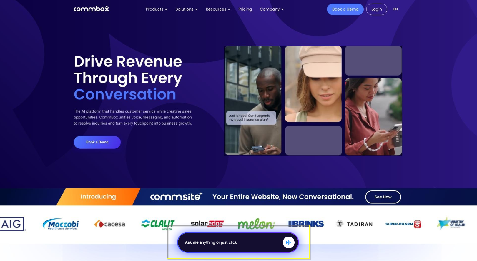
CommSite by CommBox transforms your existing website into an interactive, AI-powered conversational experience, replacing static menus and endless clicks with natural, human-like interactions.
The content displayed in the CommSite app is configured within the AI Agent or Chatbot, including greeting cards, available cards, and their associated functionalities.
General CommSite UI/UX settings—such as color themes, launcher behavior, and other presentation options—are configured in the CommSite channel settings.
This guide covers all aspects of Commsite, including those configured at the automation (AI Agent, AI Chatbot, and Chatbot).
Key Features
-
AI-Powered Conversations
Delivers fast, accurate responses trained on your own business content. -
Personalized Recommendations
Suggests products, services, or content based on user intent in real time. -
Language Recognition
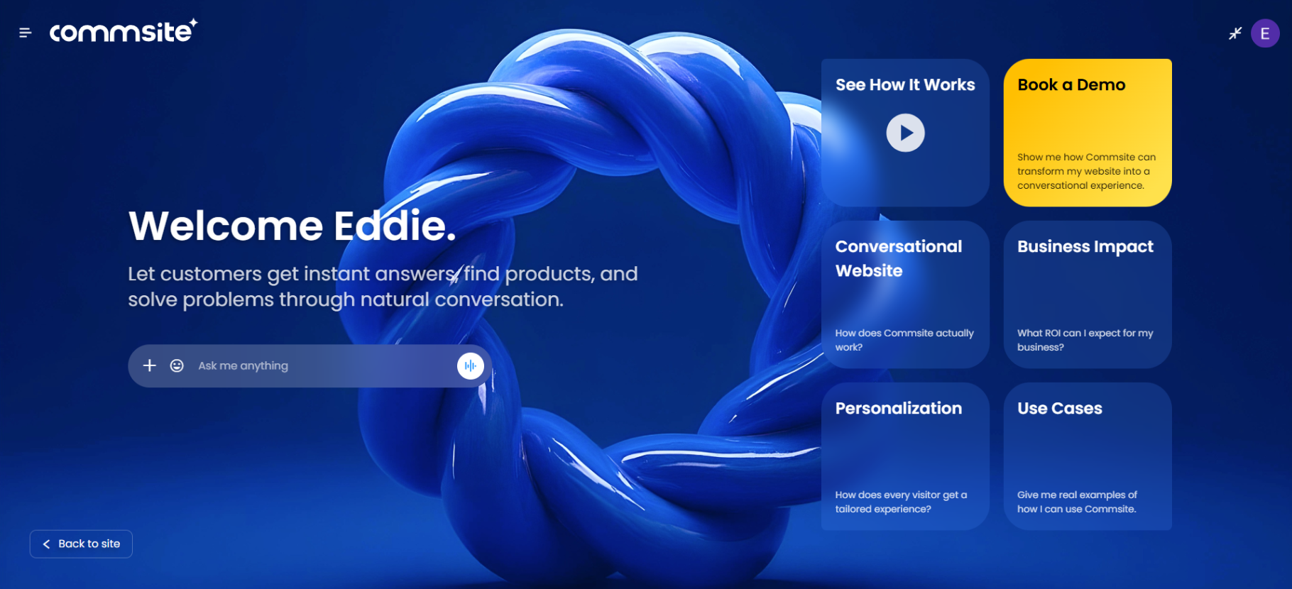
CommSite’s AI Agent automatically detects the language set in the user’s browser and displays content accordingly. Users can manually change the language at any time via the language settings (accessible from their initials in the top corner).
.png)
-
System Integrations
Connects with your CRM, inventory, bookings, and payment systems for real-time actions. -
Secure & Compliant
Enterprise-grade security, SOC 2 and GDPR compliance, encrypted communications.
Components
CommSite is an advanced AI chat that leverages your website content and delivers it as a conversation.
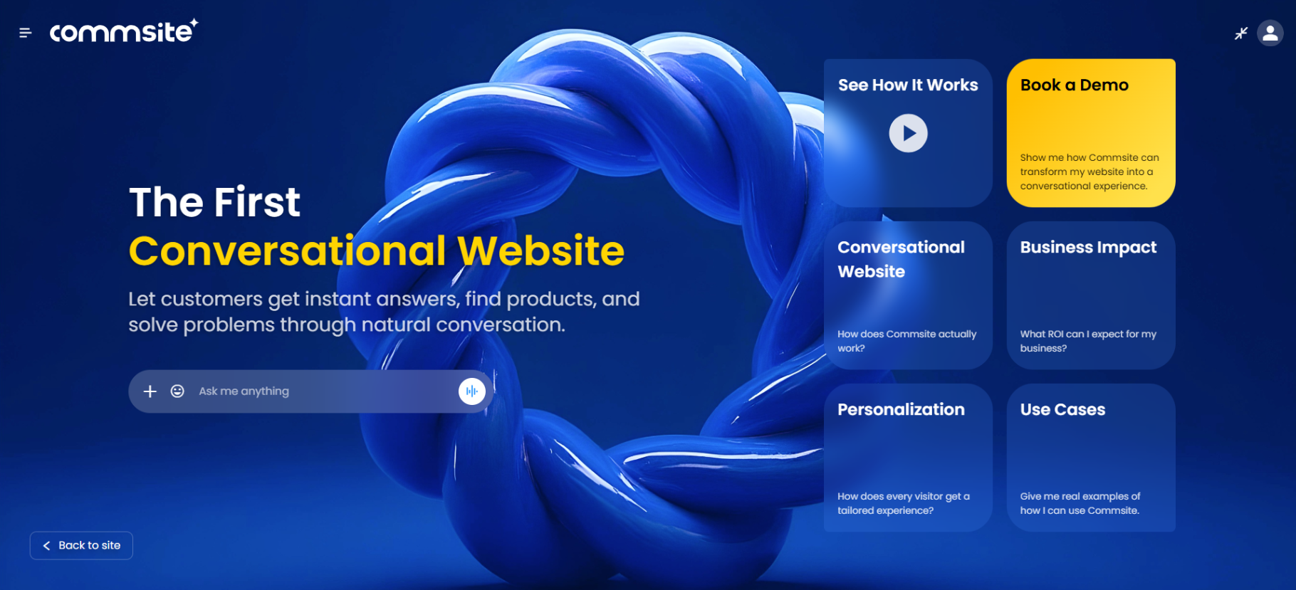
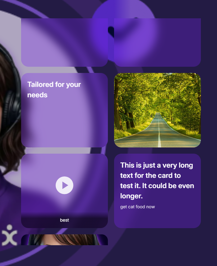
● The Launcher - Chat bar on the webpage that opens CommSite. Can display Text Greeting Cards that let the visitors jump right into specific topics.
● Chat Input Bar – Enables the customer to ask open-ended questions to start a conversation with the AI Agent.
● Greeting Cards (up to 20) – Provide quick links to commonly requested services or product information.
● Hands Free – Activated by clicking the voice input icon in the chat input bar.
During the Conversation:
● The customer’s interactions are clearly displayed, including any attachments added via the + button in the chat input bar.
● Conversation history lets customers view past topics and continue exactly where they left off.
● Dynamic cards appear during the conversation, offering context-relevant links that enable further actions.
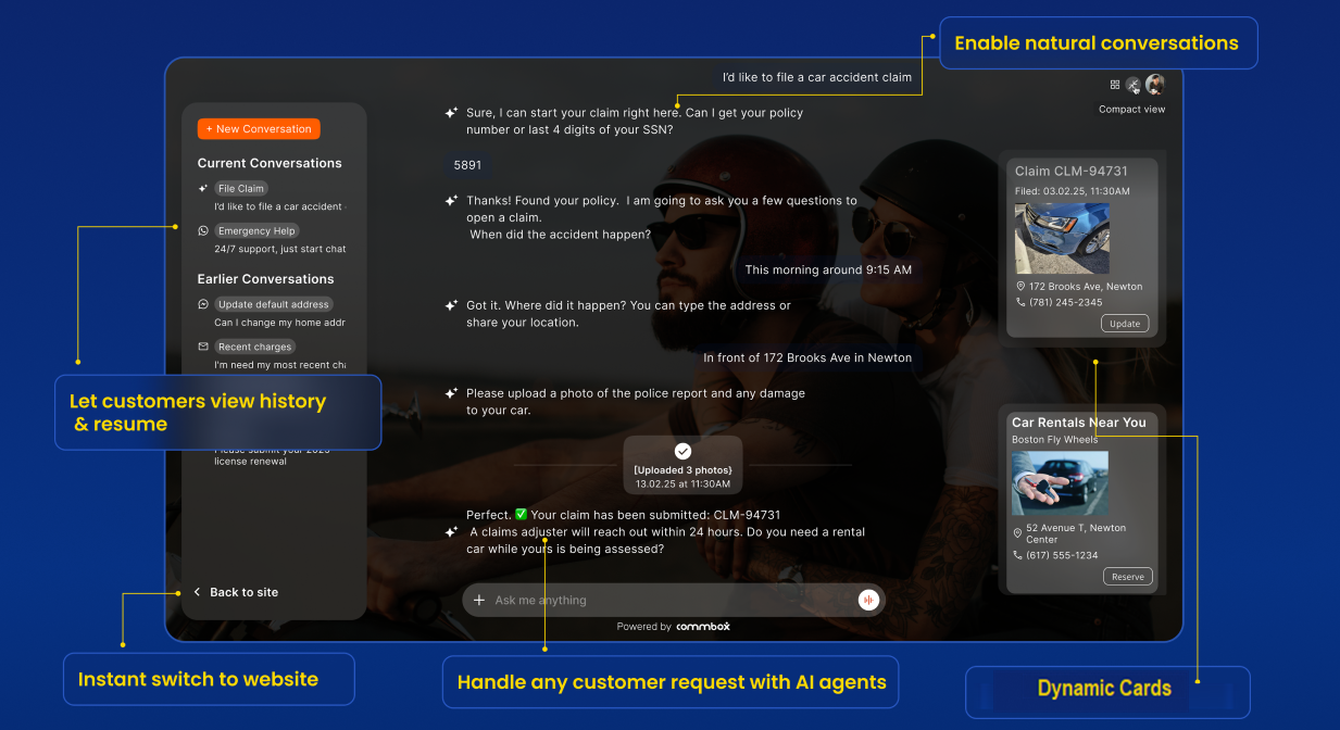
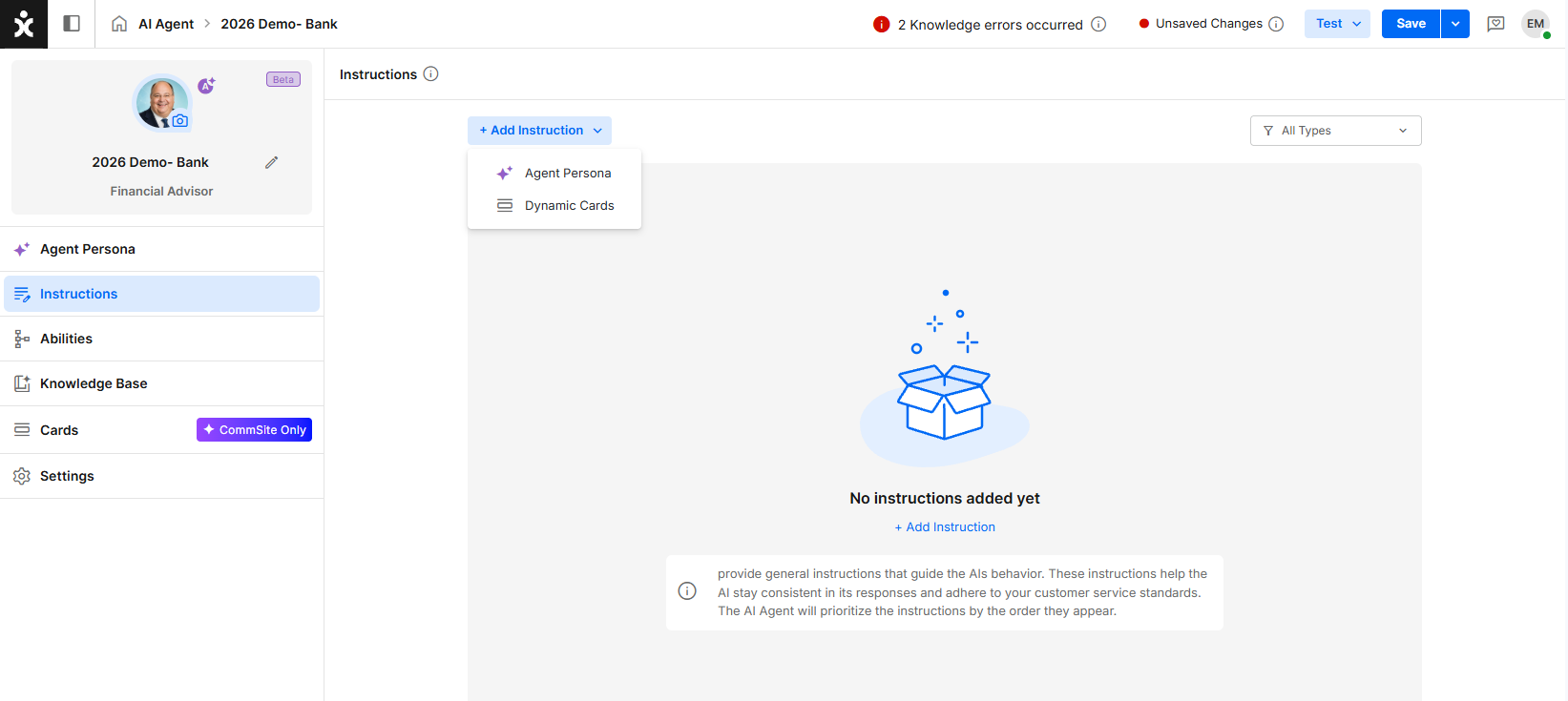
Dynamic Cards
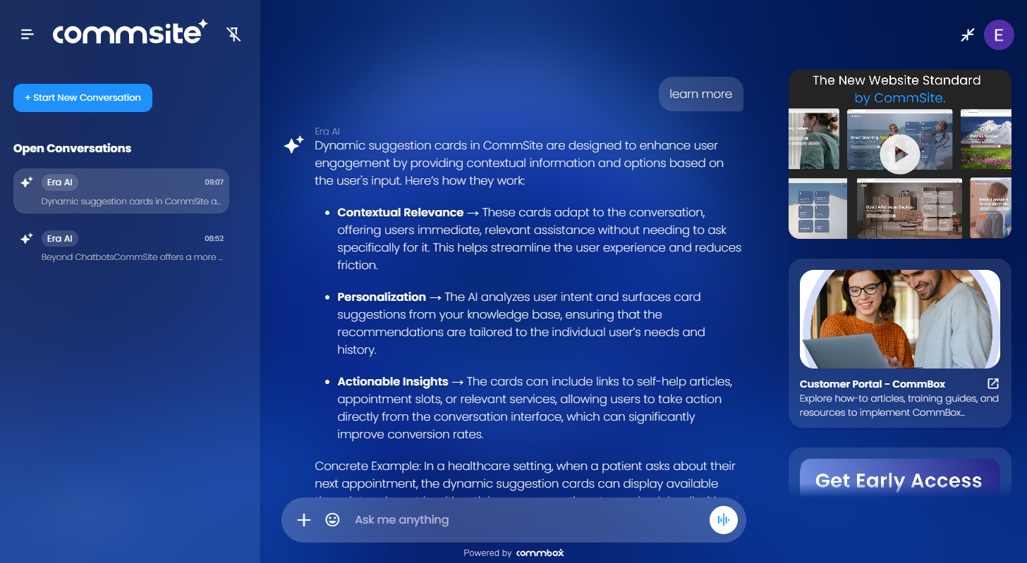
CommSite Dynamic Cards function as a secondary AI layer that operates alongside the conversation. Each card has its own configuration, rules, and purpose, allowing the system to present relevant content dynamically based on context and user behavior.
Types of Cards
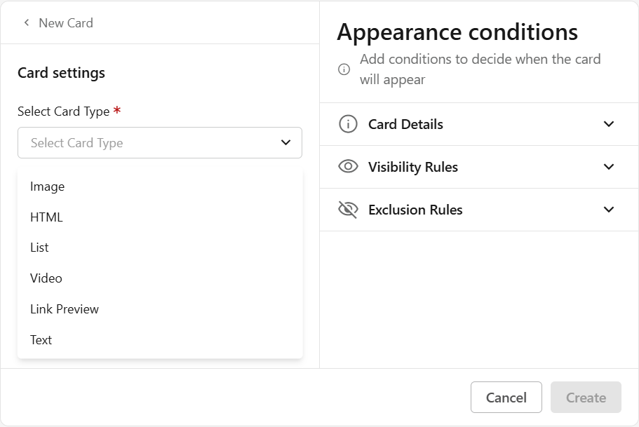
Image
Shows a single image.
- Enter a unique Title for this card (mandatory)
- Alternative text (optional)
Describe the image (HTML alt attribute). This improves accessibility and supports SEO. - Select the click action (mandatory)
- Open web page – Enter the URL
- Go to step – Select a step ID from the flow - Not available for AI Agent
- Prefilled message – Enter the message to populate in the chat input (on behalf of the customer)
- Upload an image for the card. (mandatory)
Use Case: A user asks about a specific product and needs a visual reference.
Example: An Image Card could show the title "Product X - Latest Model" and display an image of "Product X."
HTML
Supports custom HTML for advanced layouts or embedded media.
- Enter a unique Title for this card (mandatory)
- Paste your HTML code
Use Case: You need to display rich, custom content or embed external media that other card types do not support.
Example: An HTML Card could embed a short video tutorial on using a specific feature, or display an interactive form for collecting feedback, directly within the card.
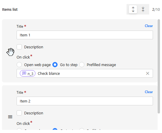
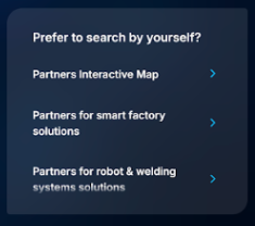
List
Displays a structured list of up to 10 items.
-
Enter a unique Title for this card (mandatory)
-
For each item:
- Enter Title and Description
- Enter a description (optional)
- Select an action:
- Open web page (URL)
- Go to step (select from flow) - Not available for AI Agent
- Prefilled message – Enter the message to populate in the chat input (on behalf of the customer)
-
Click + Add Item to add another item to the list.
Note: Change the order of the listed items by hovering over the menu icon, click-holding, and dragging to the desired position.
Use Case: A customer is asking about product categories.
Example: A List Card could display "Popular Product Categories" as the title, and the list items could be "Electronics," "Apparel," "Home Goods," and "Books," allowing the user to select one to explore further.
Video
Opens a video for the user.
- Enter a unique Title (mandatory)
- Enter the video’s embedded URL
- Video must be public and use this format: https://www.youtube.com/embed/[YouTube Video ID]
- How to find the Video ID:
From a standard YouTube link: https://www.youtube.com/watch?v=J5ydl_M6J6w&list=PLj5M3ZDkCC2Mu56OkXUjB7
The Video ID is: J5ydl_M6J6w (Ignore extra parameters like &list=...) - Note: Private videos or those on a site that block third-party embedding cannot be used
- Upload the Video Thumbnail. You can add a description that will appear beneath it.
Use Case: A user asks about a general service or product and needs a visual reference.
Example: A Video Card could show a short “how-to” clip that explains the steps required for the task ahead.

Linked Preview
Displays a preview of the link provided for the user.
-
Enter a unique Title (mandatory)
-
Enter the video’s embedded URL
- Video must be public and use this format: https://www.youtube.com/embed/[YouTube Video ID]
- How to find the Video ID:
From a standard YouTube link: https://www.youtube.com/watch?v=J5ydl_M6J6w&list=PLj5M3ZDkCC2Mu56OkXUjB7
The Video ID is: J5ydl_M6J6w (Ignore extra parameters like &list=...) - Note: Videos that are private or block third-party embedding cannot be used.
-
Upload a preview image
Use Case: A customer asks about policy details or wants to review supporting documents online, and you want to provide a clear preview before they open the full page.
Example: If a customer asks, “What does my travel insurance cover?” a Link Preview Card could display the title “Travel Insurance Coverage Guide” and show a short description: “Learn what is included in your travel insurance plan, including medical coverage, cancellations, and lost baggage.” Once clicked, the customer would be directed to the coverage document on the company’s website.
Text
Displays a simple heading with a description.
- Enter a unique Title for this card (mandatory)
- Enter the Description that will appear at the bottom of the dynamic card.(optional)
- Select a click action:
- Open web page (URL)
- Go to step – Select a step ID from the flow - Not available for AI Agent
- Prefilled message – Enter the message to populate in the chat input (on behalf of the customer)
Text Cards used within Greeting Cards can be displayed above the launcher as suggested conversation starters.
A common use case for the Prefilled Message option is to present a short question or topic on behalf of the customer, helping initiate a conversation. For example: “I need a loan” or “I want a new credit card.” Make sure the Agent has the needed KB to answer the question.
.png)
Appearance Conditions
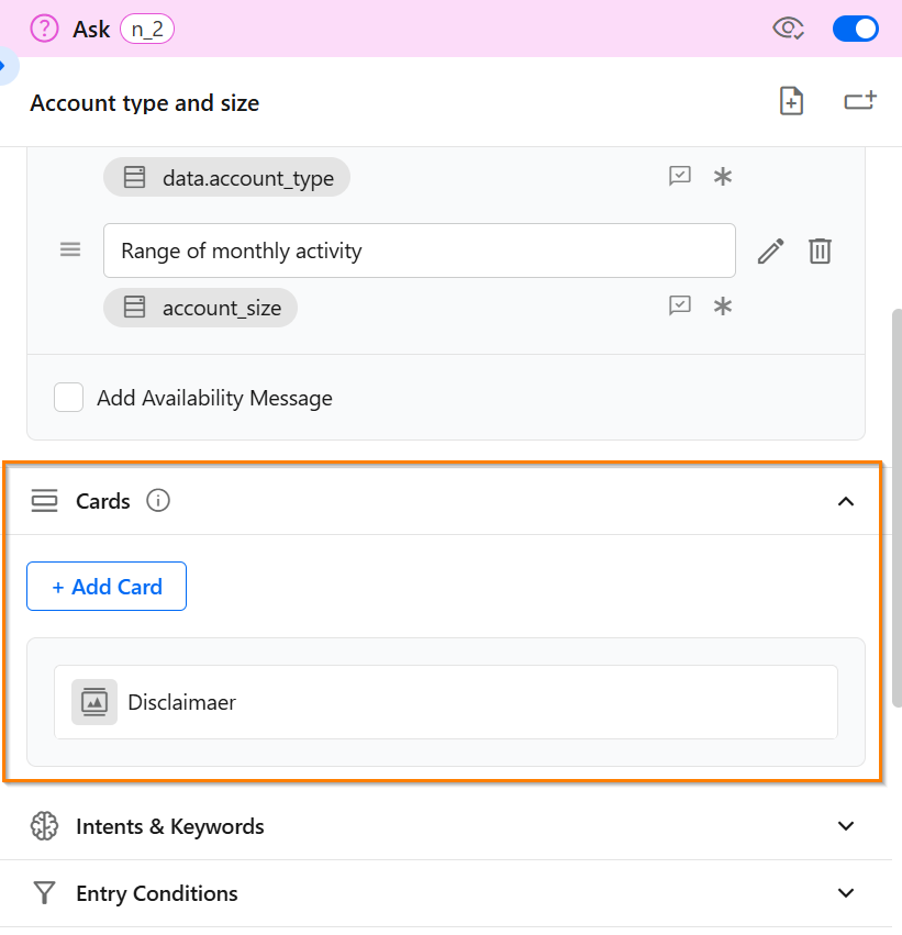
Add conditions and general attributes to guide the system on when to display each card. These settings are for internal use only and will not be shared with the user. Note that the card's position is fixed on the page, so set the background design to support proper visibility.
Card Details:
-
Card category
Select what type of information the card presents: Product, Service, Process, Content -
Card Purpose
Select the general goal of the card: Upsell, Cross Sell, Next Step, Support, Education, Promotion, and Compliance -
Description
Describe the card’s purpose in your own words and when it should appear. -
What it does (Outcome when clicked)
Describe the card’s action (e.g., redirects the user to the product page)
Visibility Rules:
- Audience
Restrict to a specific audience group - Visible to
Select between Public (both), Visitors, or Logged-in users - Customer tags
The card will only display for users tagged with the selected customer’s Tag (e.g., VIP).
Exclusion Rules
- When not to display
Define scenarios where the card should be hidden (e.g., Example: Do not show when the user requests a human agent ) - Max impressions per session
Limit how many times the card appears in a single conversation.
AI Agents & Cards Configuration
When creating an AI agent for Commsite, consider the following:
Card Instructions
Instructions for the cards are selected in the AI Agent Instructions. This is typically used for general UX modifications and not card-specific. For example: “Always place video cards on top”, or “Sales or marketing cards should always be last”.
Dynamic vs. Static Cards
- Dynamic Cards:
Displayed automatically by the AI Agent based on:- Conversation context
- Appearance conditions
- Configured instructions
- Static Cards:
Attached to specific steps in a flow and always appear when that step is reached.
Their configuration follows the same setup as Dynamic Cards.
Cards Management
CommSite supports all automation types, from basic Chatbots with no AI capabilities to AI Chatbots and AI Agents.
When AI is enabled in an automation's settings, a standard Chatbot is upgraded to an AI Chatbot and may require additional configuration.
Cards Behavior
For Chatbots, cards are configured directly within individual flow steps. A card is displayed whenever the customer reaches the step where it is configured.
For AI Chatbots and AI Agents, cards are displayed dynamically by a secondary AI model. Based on the conversation context and the configured instructions in the Appearance conditions section, the AI determines which card(s) to display and when.
Greeting Cards
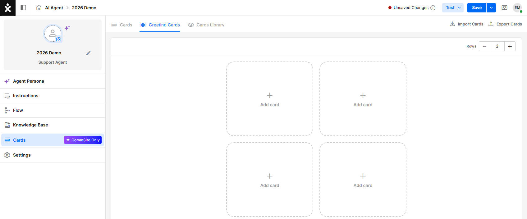
Greeting cards appear at the welcome screen before the start of the conversation. Use these cards to offer non-intrusive shortcuts to relevant articles, tools, and actions (e.g., “Track my order”, “Book a demo”, or “Learn more…”).
To add a card to the greeting screen, click an empty card slot and select a card from the dialog box. You can drag cards between slots to arrange them as needed.
You can configure up to 20 greeting cards (10 rows maximum). Use the controls in the upper corner to add or remove rows.
Note: Cards are automatically condensed by the system. As a result, a single row of cards cannot be displayed.
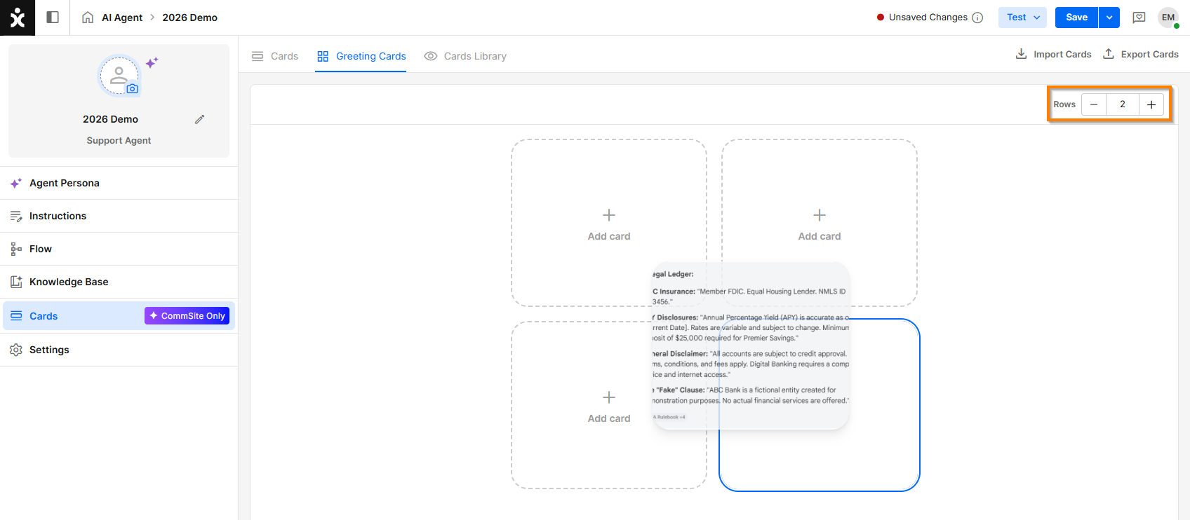
For all automation types, the automation designer defines the available greeting cards at the Chatbot, AI Chatbot, or AI Agent level. The number of greeting cards displayed simultaneously on the initial screen depends on the visitor's screen size and device.
Cards Library
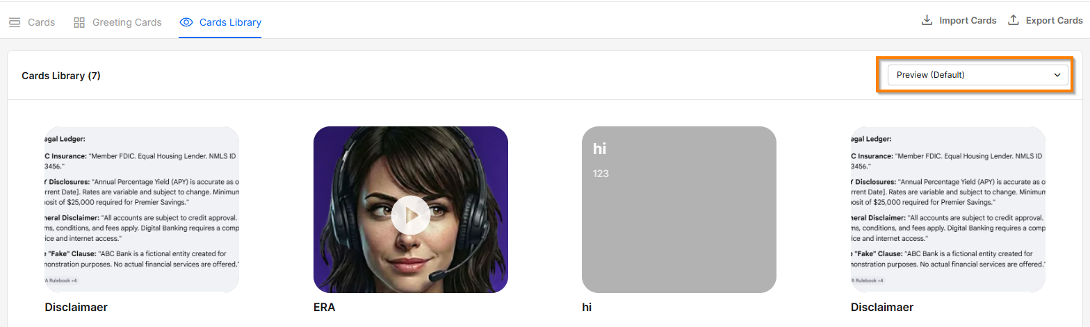
The Cards Library displays all available cards.
Use the environment selector in the preview pane to see how a card appears with the selected CommSite environment's language and color settings.
Importing / Exporting Cards
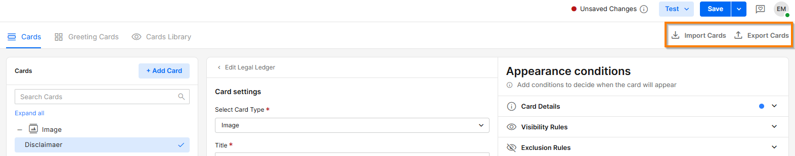
You can export a card's JSON definition to a file or import a JSON definition from a file.
Some card elements may not transfer successfully due to authentication or access restrictions. For example, image URLs are imported as-is. If the target environment does not have access to the referenced image, the image will not be displayed.
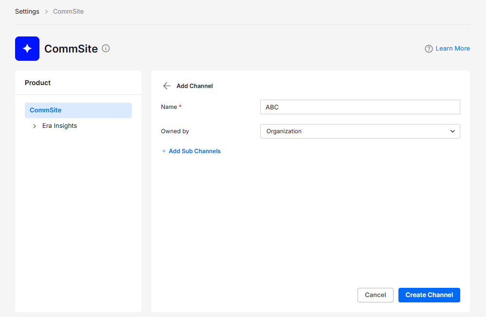
Create a New Channel
- Navigate to Settings > CommSite and click +Add Channel.
- Enter the new channel name, assigned ownership (optional), and click Create Channel. If you need ownership by more than one team, click the + sign.
Channel Settings
Note: Some settings have a visual aid when hovering over the settings to help with the application of the feature.
General
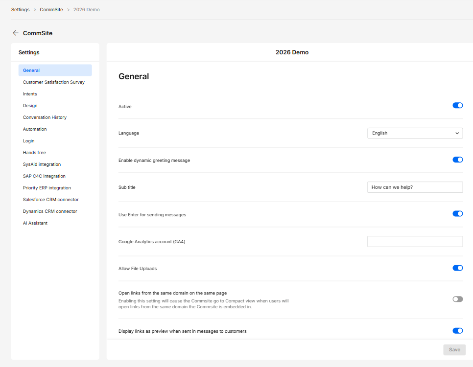
- Active – Enables or disables the channel.
- Language – Sets the default language of the CommSite. This is relevant mainly to the Launcher, as the AI will set itself the language of the user’s browser.
- Enable dynamic greeting message – Displays an automated greeting based on context.
- Sub title – Enter the secondary sentence.
- Use Enter for sending messages – Sends messages when pressing Enter.
- Google Analytics account (GA4) – Enter a GA4 account for tracking usage.
- Allow File Uploads – Allows users to upload files in chat.
- Open links from the same domain on the same page – Opens same-domain links within the existing page.
- Display links as preview when sent in messages to customers – Shows link previews in chat messages.
Customer Satisfaction Survey
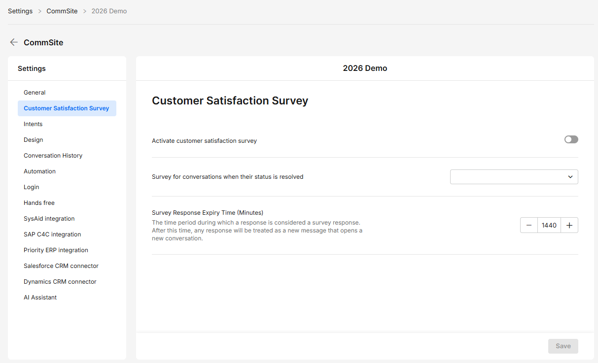
- Activate customer satisfaction survey – Enables post-conversation surveys.
- Survey for conversations when their status is resolved – Sends surveys after conversations are marked resolved.
- Survey Response Expiry Time (Minutes) – Defines how long responses count as survey replies.
Intents
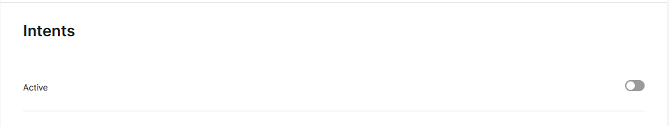
- Active – Enables or disables intent detection.
Design
General
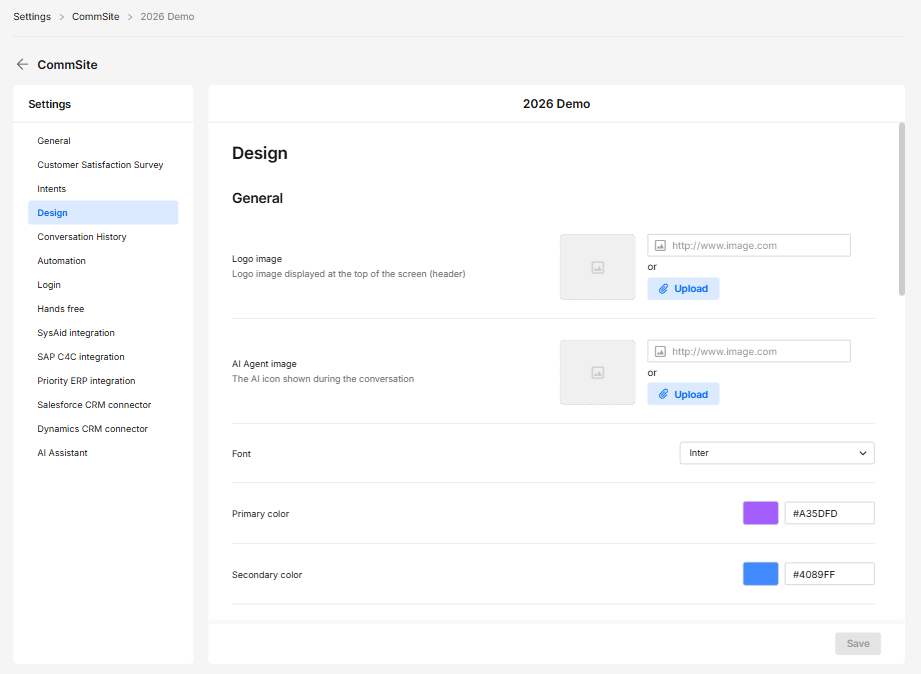
- Logo image – Displays the logo in the header.
- AI Agent image – Sets the AI agent avatar.
- Font – Defines the text font.
- Primary color – Sets the main UI color.
- Secondary color – Sets the secondary UI color.
Background
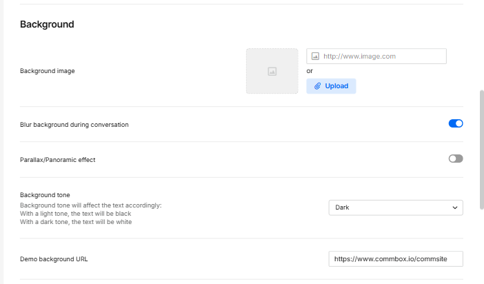
-
Background image – Sets the background image.
-
Blur background during conversation – Applies the blur effect during chat.
-
Parallax/Panoramic effect – Adds a scrolling visual effect.
-
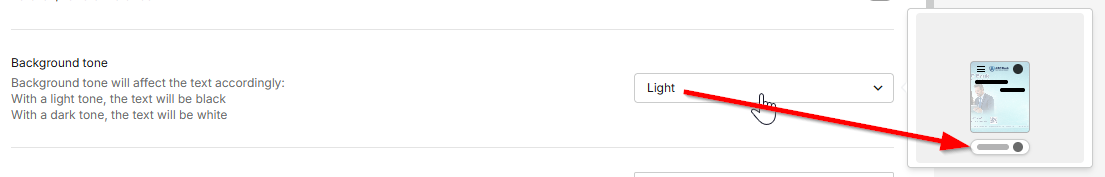
Background tone – Controls light/dark text contrast.
- With a light tone, the text will be black
- With a dark tone, the text will be white
.png)
-
Demo background URL – Sets a demo background via URL (used mainly when testing)
Launcher
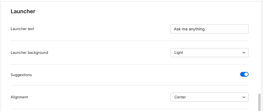
- Launcher text – Defines the text displayed on the launcher.
- Launcher background – Sets the launcher's background theme (Light or Dark).
- Suggestions – When enabled, text greeting cards are displayed above the launcher.
- Alignment – Sets the launcher's position based on the user's browser language. For right-to-left (RTL) languages, selecting End positions the launcher on the left side of the screen; for left-to-right (LTR) languages, it positions the launcher on the right.
Minimized View / View State
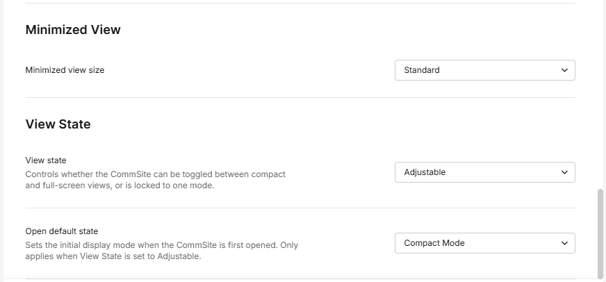
-
Minimized view size – Sets the size of the minimized widget.
-
View state – Controls available display modes (adjustable/compact/full).
-
Open default state – Sets the initial view on open.
Conversation History
Conversation History
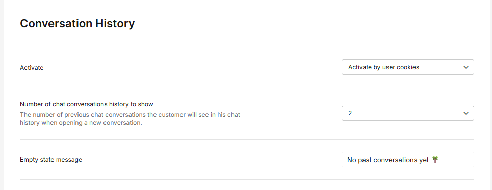
- Activate – Enables conversation history. Select to either activate by user cookies or activate only with Silent Login.
- Number of chat conversations history to show – Sets how many past conversations are shown (1-5, or all).
- Empty state message – Message shown when no history exists.
Automation
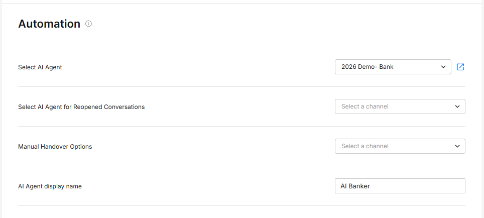
- Choose AI Agent flow – Selects the default AI Agent flow.
- Reopen AI Agent flow – Defines the flow when the conversation is reopened.
- Manual handover options – Configures manual transfer to human agents.
- AI Agent display name – Sets the AI agent’s name.
Login
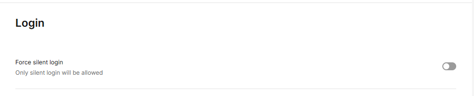
- Force silent login – Allows only automatic (silent) login.
Hands free
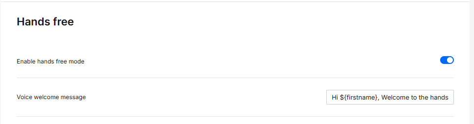
- Enable hands free mode – Enables voice-based interaction.
- Voice welcome message – Plays a voice greeting at start.
AI Assistant
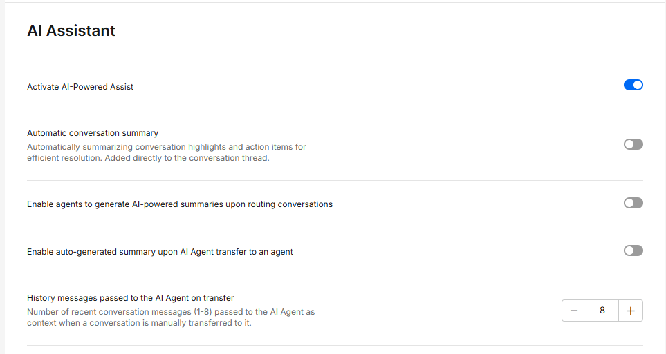
- Activate AI-Powered Assist – Enables AI-powered assistance features.
- Automatic conversation summary – Automatically adds a summary of key points and actions to the conversation after the conversation is resolved
- Enable agents to generate AI-powered summaries upon routing conversations – Allows agents to generate summaries when conversations are routed to them.
- Enable auto-generated summary upon AI Agent transfer to an agent – Automatically generates a summary when a conversation is transferred from AI to a human agent.
- History messages passed to the AI Agent on transfer –
Number of recent conversation messages (1-8) passed to the AI Agent as context when a conversation is manually transferred to it.