 Overview
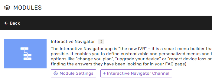
The Interactive Navigator module allows you to build a streamlined menu that steers and controls the flow of users on your company’s website.
The Navigator enables surfers to arrive at the specific place they were looking for easily and quickly.
You can arrange various menus according to your needs and transfer customers to different services or appropriate teams for further assistance as necessary.
This module relies directly on an Automation Script. A specifically-designed script is needed to connect to a navigator channel.
This module type cannot generate ordinary conversations within the system, and it is mainly used to convey information conveniently to the client's end customers.
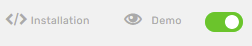
As in the Chat modules, we can look at the following channel options -
Installation - from here, we will extract the code we will insert into our site in the HEADER of the page we want to embed the navigator.
Demo - By clicking on this button, we will reach a page that simulates the site where we will eventually embed the component to edit and change the component more conveniently.
Creating a new Interactive Navigator channel
First, find the Settings icon in the lower right-hand corner to set up a new channel.
Then, find the module under Apps:
Add a new Channel, name it, and you can start setting up the channel!
Module Settings (Module)
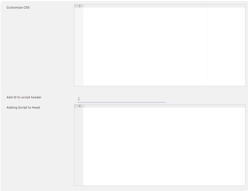
Customize CSS - A CSS code that will be loaded inside the Navigator instance to customize the UI.
Add ID to script header -
Adding Script to Head - JS code that can be added to the Navigator instance Head code. Used to customize behavior.
Adding Script to Body - JS code that can be added to the Navigator instance Body code. Used to customize behavior.
Module Settings (Channels)
Demo - With the help of the demo, you can make changes to the settings (listed as seen in the screenshot below) and view them.
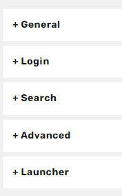
General
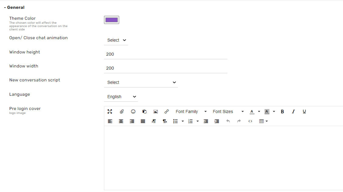
Theme color -
This specified color is the Navigator’s primary color.
Open/ Close chat animation
Situation -
- Popup - Opens another window.
- Slider - A window opens above the button inside the website
Window height -
Setting the window height.
Window width -
Setting the window width.
New Conversation Script - The most important setting in this module. This specific script is connected to the Interactive Navigator module and is defined as the channel script.
Language -
The component’s operating language.
Pre Login Cover -
Settings that determine what is displayed for the end customer when first accessing the navigator.
Login
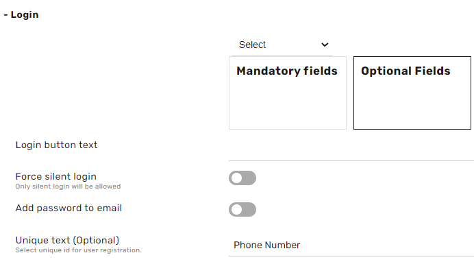
Fields (Mandatory & Optional) -
This section determines which fields the end customer will be required to input to advance in the log-in process and which are optional.
For example, First Name, Last Name, Email Address, etc., are required fields. The client card will display this information for the representative’s use.
Login button text - this is the text which will appear on the login button
Force silent login -
Log in without providing identification information through early identification of details made in the URL.
Add password to email -
If the fields for entering an email are set, a password will be requested.
Unique text (Optional) -
If selected, this will display the text defined here, which will be displayed as the Unique ID field label.
Unique ID field on the customer card on the administrator’s system. (Example: Nat’l ID number, passport number, etc.)
Search
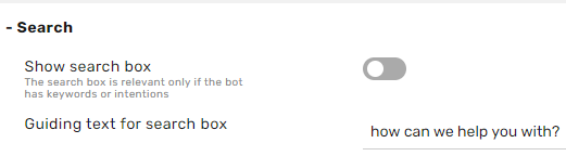
Show search box -
Toggles whether to display a search box in this navigator.
Search box guideline text -
Sets the text that will appear as a placeholder in the search box.
Advanced
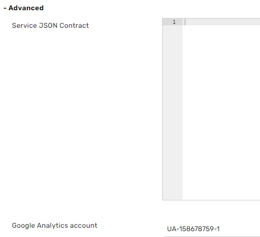
Service JSON Contract -
In this section, you can embed a request to Web Service and record a new customer who has been removed. This capability is also possible from the scripts themselves.
Google Analytics account - Account ID for the Googe Analytics account which is connected with the Agent Workspace brand
Launcher
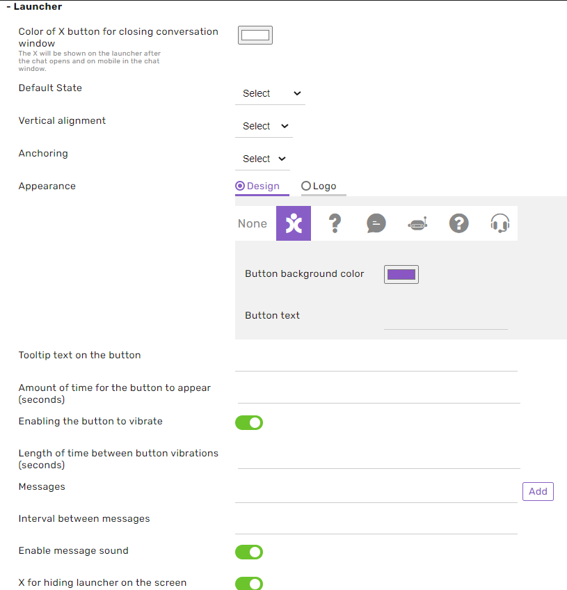
Color of the X button for closing the conversation windows - usable when the opening button is set to ‘hidden’ -The X will be shown on the launcher after the chat opens and on mobile in the chat window.
Default State -
- Open - The window is open at the entrance to the website.
- PreButton - the button is displayed, and clicking on it opens the window.
- Hidden - The button will be hidden and pop up after the user's specific amount of time.
You can set a wholly hidden button and set the chat to pop up by implementing the function as a button - BY.show () Or CB.show ()
Vertical alignment -
- Button - The button will be at the bottom of the screen
- Middle - The control will be in the middle of the screen
Anchoring
- Right - The button will be on the right side of the screen
- Left - The button will be on the left side of the screen
Appearance -
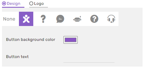
Icon selection - you can choose one of our icons to be inside the launcher.
Button background color - choose the color background of your launcher
Button text - you can add text to your launch alongside your icon or without an Icon.
Logo -
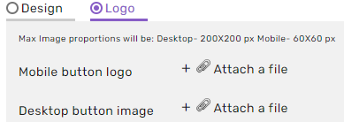
Uploading the website’s desktop button - uploading an icon that will replace the chat icon on the desktop/laptop computer
Uploading the website’s mobile device icon - uploading an icon that will replace the chat icon on the mobile device
Tooltip text on the button - the text that will appear when the mouse cursor hovers over the channel button
Amount of time for the button to appear (seconds)
If in Initial Mode, the initial state of the button has been set to hidden, this setting is determined after a few seconds the chat window will open.
Desktop Image URL -
Upload an image to replace the feature’s button on your computer
Mobile Website Button Image Address -
Upload an image that will replace the feature’s button on your mobile device.
Alternate button text -
The personalized text that appears when hovering over the channel button.
Activate Button shake -
The purpose of the button shake is to attract the user's eye to the chat feature.
Length of time between button vibrations (seconds) -
Determining the frequency of the button’s vibrations
Messages -
These messages will pop up from the launcher button and can catch the focus of the customer and maybe invite him/her to press the Navigator launcher.
Time elapsed between messages -
Determines the time allowed to elapse between the displayed messages that emerge, as explained in the previous section.
Enable message sound -
Enable sound for every new agent’s message notification on the customer side.
X for hiding launcher on the screen -
when this setting is on, an X icon will appear on the launcher with text/image that will enable the user to hide the launcher from the screen.